With modern Pokemon games, 3D models are used to display the Pokemon in battle on the current hardware, the Nintendo Switch. But what about before the Nintendo Switch? In the older Pokemon games, simpler methods of display were used: sprites. Sprites are pixelated drawings of characters in game, mainly used by older video game systems like the Game Boy Advance.
With each Nintendo game’s release, the style of these sprites changed, getting larger and more detailed until 3D models were introduced. Sprites even have moving parts in “Pokemon Black and White,” but while the moving parts cannot be made in a sprite, the style of the sprites themself can be used. The process is more simple than it seems, it just takes some time and practice.
Now, as with any art, the first thing to do is to get an idea of what to draw. For reference, a new sprite will be created for demonstration. Once there is an idea in mind, the drawing can begin. It is recommended that newbies use https://www.piskelapp.com/p/create/sprite or something similar in complexity. This program is what will be used for the examples.
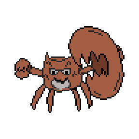
The next part of the spriting process is to create an outline of the desired product. This may be difficult to get right on the first attempt, so multiple drafts may improve the design. Below is the example outline that has been drawn. The first draft will likely not look like this, this was the result after about a dozen attempts.

One common mistake that new spriters will make is staircasing, which occurs when the pixels that make up the outlines look like a staircase, overlapping and ruining a smooth look. Another common mistake is missing stray pixels, which are unintended pixels that are off to the side of the sprite. Missing these pixels can lead to a flawed final design. Finally, making the outline too pointy can have a negative effect on the final drawing; sharp and pointy bits can benefit a sprite, but too many can take away from it. When it comes to making the outline too pointy or smooth, moderation is key. Below is an example of staircasing, and how it should look when it is fixed.

Once a proper outline has been created, the next step is to choose a color palette for the sprite. Once a palette has been chosen, color in the sprite as you see fit, stick to one main shade for each body part. Again, this may take multiple attempts to perfect the sprite. Nothing too fancy is required yet, so hold off on shading. Make sure that the colors chosen do not clash with each other, which should be easy to judge at a glance.

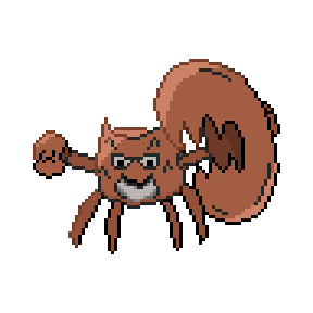
Shading is different depending on the game that the sprite is being based off of. In Pokemon’s generation three, for example, there is a large amount of dithering present. Dithering is a style of shading that uses alternating shades of a color that connect, for a bit of a blend. However, future generations tend to shy away from dithering, so using it less is not a bad idea. The light tends to come from the upper left corner of the sprite, so color pixels in that area a lighter shade of the first color used to create the effect of that area being brighter.

The final step to making a sprite is to shade the outline, since a solid black outline does look kind of strange. Just like shading the body of the sprite, the outline should be shaded too.


